Internet News
Consistent Character Maker Update
A couple months ago, I wrote about how design tools are the new design deliverables and built the LukeW Character Maker to illustrate the idea. Since then, people have made over 4,500 characters and I regularly get asked how it stays consistent. I recently updated the image model, error-checking, and prompts, so here's what changed and why.
New Image ModelGoogle recently released a new version of their image generation model (Nano Banana 2) and I put it to the test on my Character Maker. The results are noticeably more dynamic and three-dimensional than the previous version. Characters have more depth, better lighting, and more active poses. So I'm now using it as the default model (until Reve 1.5 is available as an API).
One of the ways I originally reinforced consistency in my character maker was by checking whether an image generation model's API returned images with the same dimensions as the reference images I sent it. If the dimensions didn't match, I knew the model had ignored the visual reference so I forced it to try again. In my testing, this was needed about 1 in every 30-40 images. A very simple check, but it worked well.
A week into using Nano Banana 2, that sizing check started throwing errors. Generated images were no longer coming back with the exact dimensions of my reference images, breaking my verification loop. I had to resize the reference images to match Google's default 1K image size (1365px by 768px). But that took away my consistency check, so I had reinforce my prompt rewriter to make up for it.
Update: A day after publishing this overview, Google quietly changed the image format their API returns (from PNG to WEBP). This made image dimensions read incorrectly, causing every generation attempt to fail. Had to implementation a fix that works regardless of what format Google decides to send back.
Prompt Rewriter IterationThis is where most of the ongoing work happens. As real people used the tool, edge cases piled up and the first step of my pipeline (prompt rewriting) had to evolve. For example, my character is supposed to be faceless (no eyes, no mouth, no hair). This had to be reinforced progressively over several iterations. Turns out image models really want to put a face on things.
For color accuracy, I shifted from named colors like "lime-green" that relied on the reference images for accuracy to explicitly adding both HEX codes and RGB values. Getting the exact greens to reproduce consistently required that level of specificity. I also added default outfit color rules for when people try to request color changes.
Content moderation expanded steadily as people found creative ways to push boundaries. I blocked categories like gore, inappropriate clothing, and full body color changes, while loosening rejection criteria from blocking any "appearance changes" to only rejecting clearly inappropriate inputs. The goal: allow creative freedom while preventing abuse.
The overall approach was: start broad, then iteratively tighten character consistency while expanding content moderation guardrails as real usage revealed what was needed.
At this point, my character comes back consistent almost every time. About 1 in 50 generations still produces an extra arm or a mouth (he's faceless, remember?). I've tested checking each image with a vision model then sending it back for regeneration if something is off (examples above). But given how rarely this happens and how much latency and cost it would auto check every image, it's currently not worth the tradeoff for me. For other uses cases, it might be?
If you haven't already, try the LukeW Character Maker yourself. Though I might have to revisit the pipeline again if you get too creative.
Durable Patterns in AI Product Design
In my recent Designing AI Products talk, I outlined several of the lessons we've learned building AI-native companies over the past four years. Specifically the patterns that keep proving durable as we speed-run through this evolution of what AI products will ultimately become.
I opened by framing something I think is really important: every time there's a major technology platform shift, almost everything about what an "application" is changes. From mainframes to personal computers, from desktop software to web apps, from web to mobile, the way we build, deliver, and experience software transforms completely each time.
There's always this awkward period where we try to cram the old paradigm into the new one. I dug up an old deck from when we were redesigning Yahoo, and even two years after the iPhone launched, we were still just trying to port the Yahoo webpage into a native iOS app. The same thing is happening now with AI. The difference is this evolution is moving really, really fast.
From there, I walked through the stages of AI product evolution as I've experienced them.
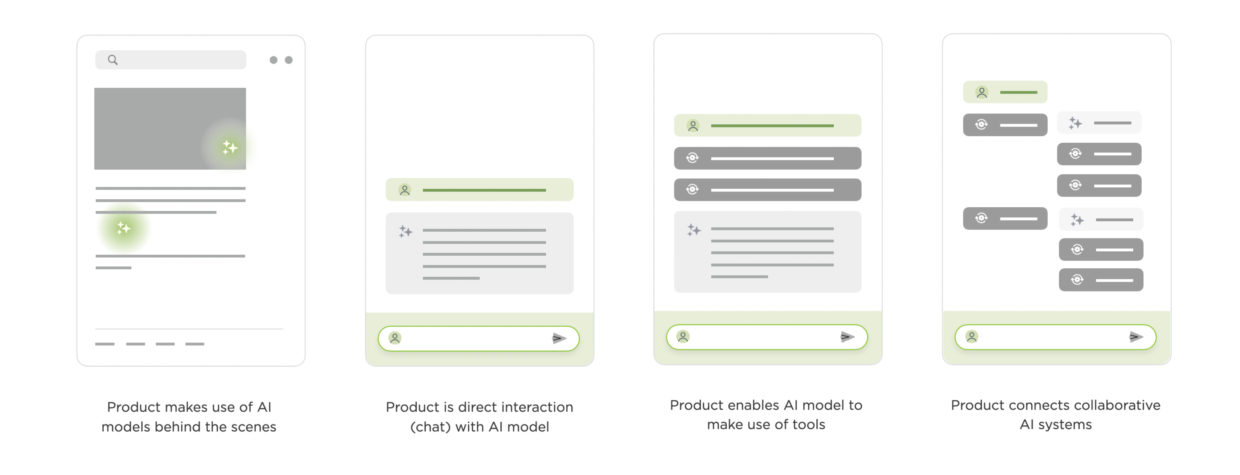
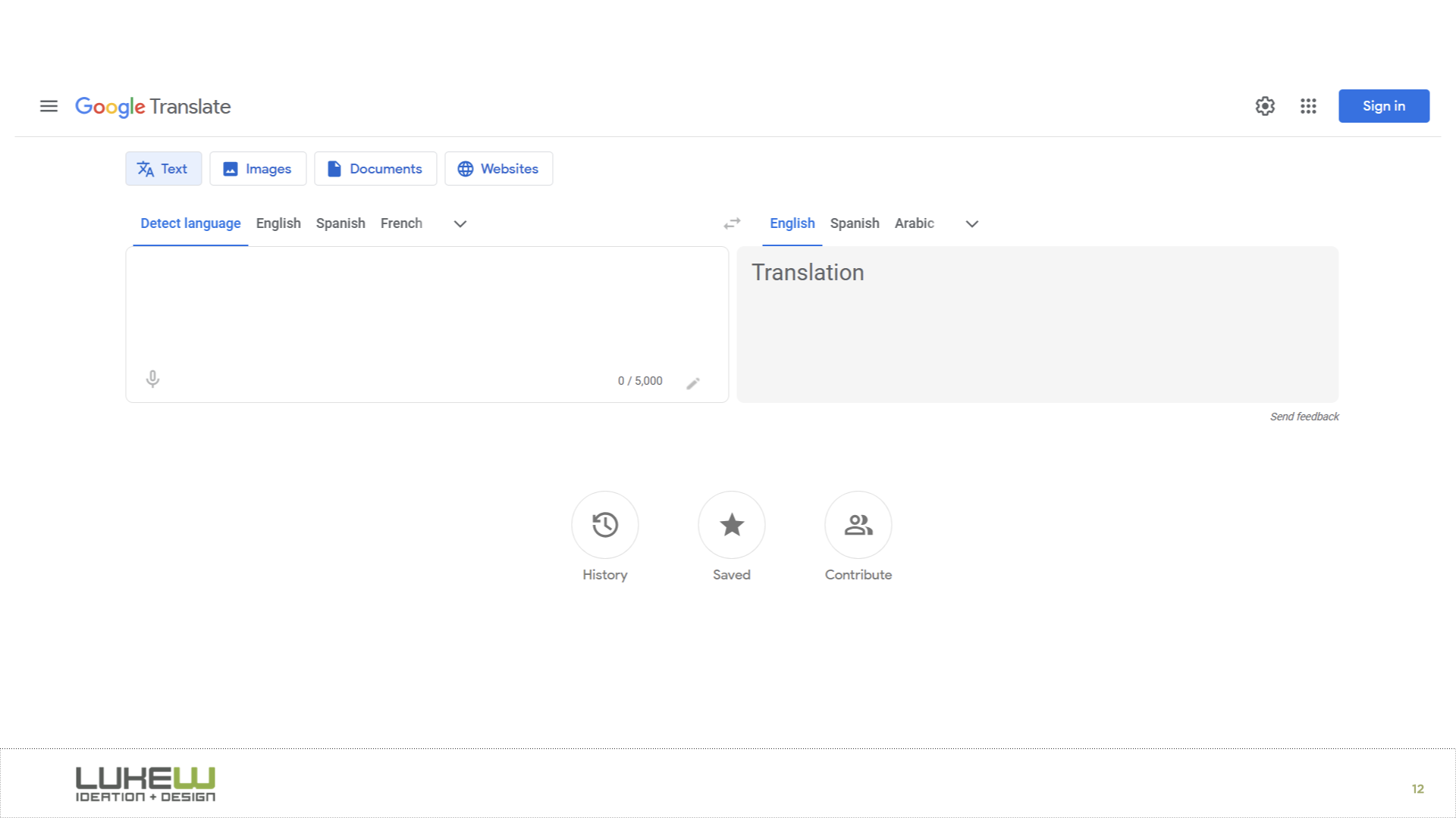
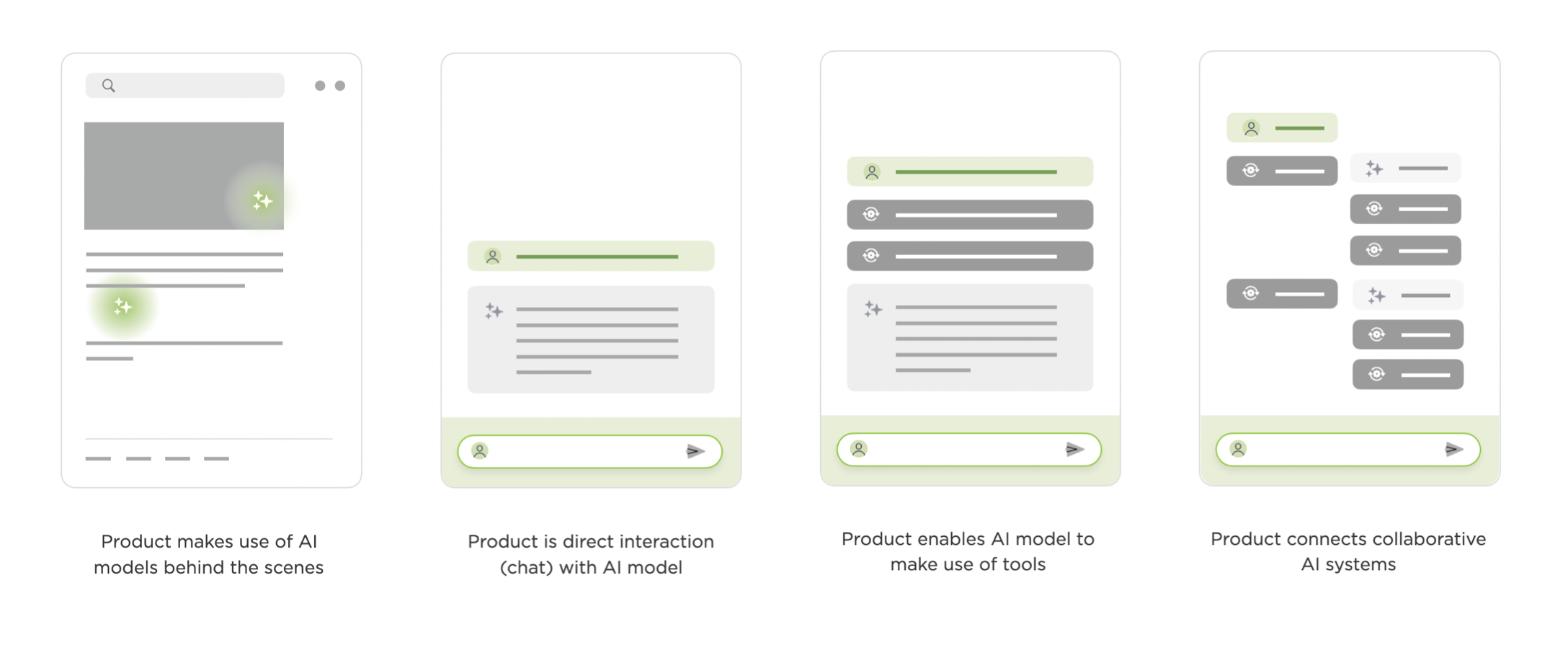
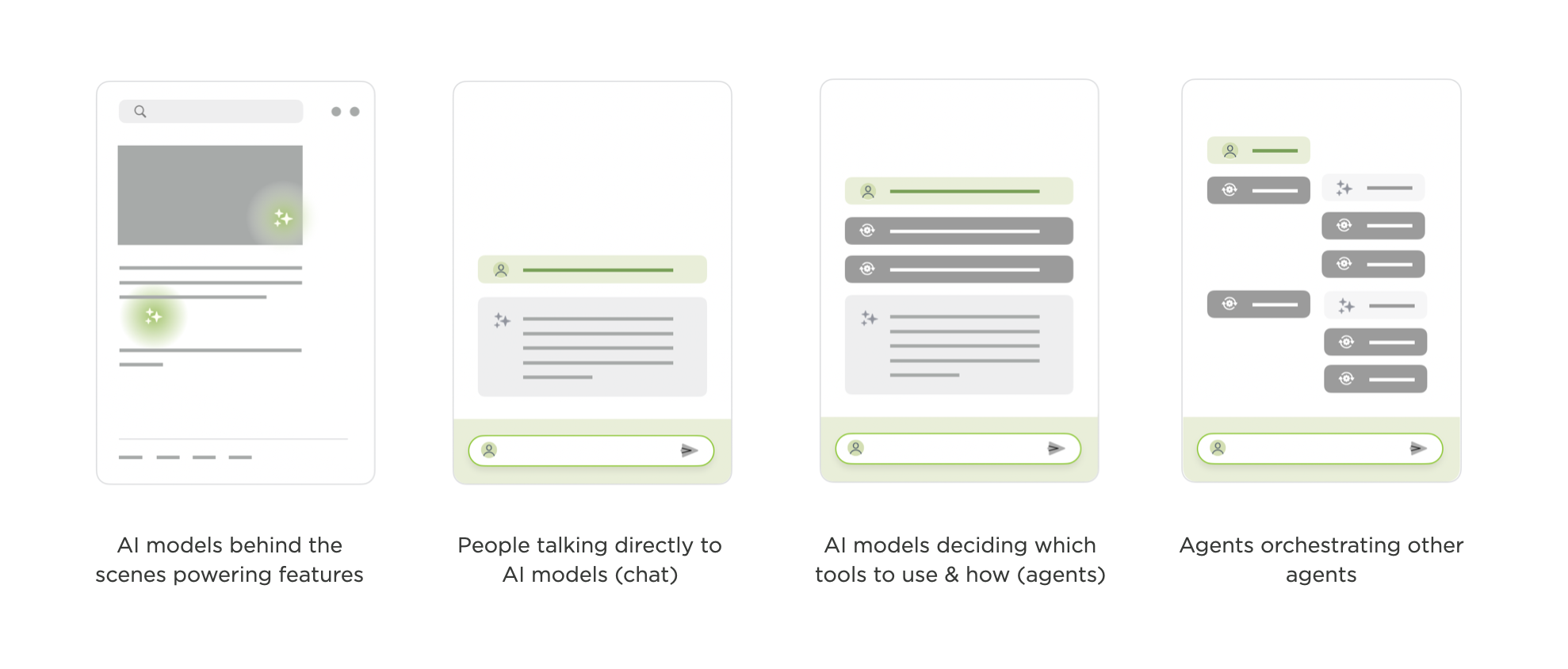
The first stage is AI working behind the scenes. Back in 2016, Google Translate was "completely reinvented," but the interface itself changed not at all. What actually happened was they replaced all these separate translation systems with a single neural network that could translate between language pairs it was never explicitly trained on. YouTube made a similar move with deep learning for video recommendations. The UIs stayed the same; everything transformative was happening under the hood.
I remember being at Google for years where the conversation was always about how to make machine learning more of a core part of the experience, but it never really got to the point where people were explicitly interacting with an AI model.
That changed with the explosion of chat. ChatGPT and everything that looks exactly like it made direct conversation with AI models the dominant pattern, and chat got bolted onto nearly every software product in a very short time. I illustrated this with Ask LukeW, a system I built almost three years ago that lets people talk to my body of work in natural language. It seems pretty simple now, but building and testing it surfaced a few patterns that have carried over into everything we've done since.
One is suggested questions. When you ask something, the system shows follow-up suggestions tied to your question and the broader corpus. When we tested this, we found these did an enormous amount of heavy lifting. They helped people understand what the system could do and how to use it.
A huge percentage of all interactions kicked off from one of these suggestions. And they've only gotten better with stronger models. In our newer products like Rev (for creatives) and Intent (for developers), the suggestions have become so relevant that people often just pick them with keyboard shortcuts instead of typing anything at all.
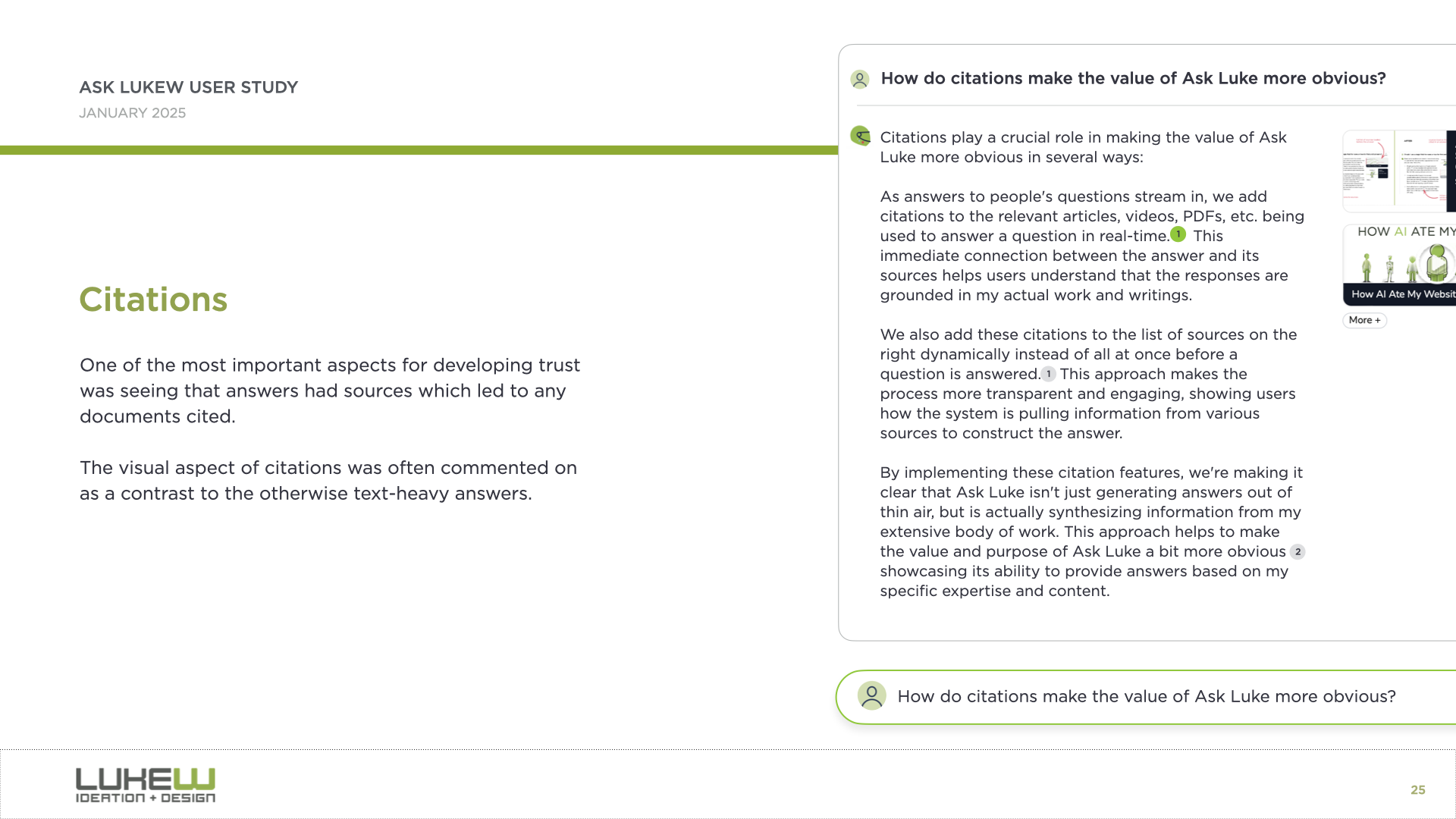
Another pattern is citation. Even just seeing where information comes from gives people a real trust boost. In Ask LukeW, you could hover over a citation and it would take you to the specific part of a document or video. This was an early example, but as AI systems gain access to more tools and can do much more than look up information, the question of how to represent what they did and why in the interface becomes increasingly important.
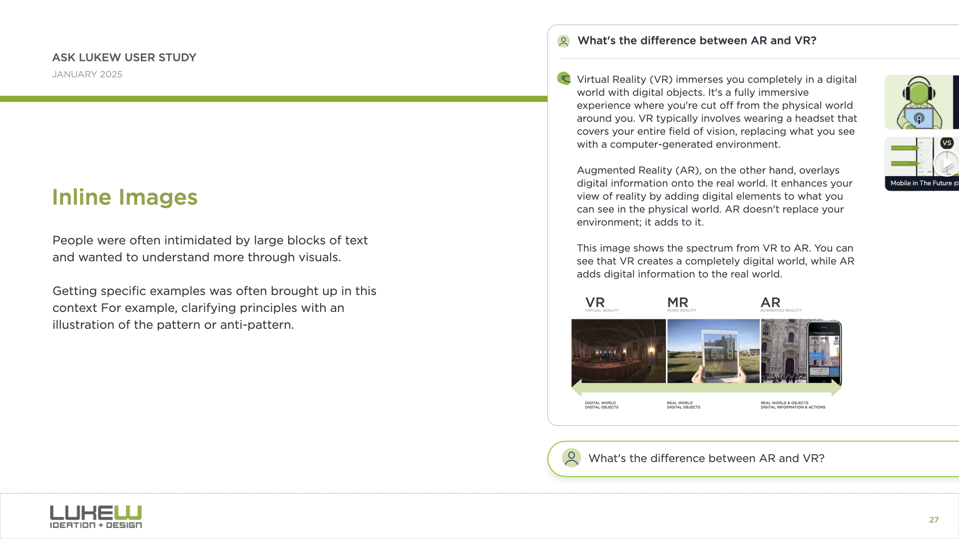
And the third is what I call the walls of text problem. Because so much of this is built on large language models, people are often left staring at big blocks of text they have to parse and interpret. We found that bringing back multimedia, like responding with images alongside text, or using diagrams and interactive elements, helped a lot.
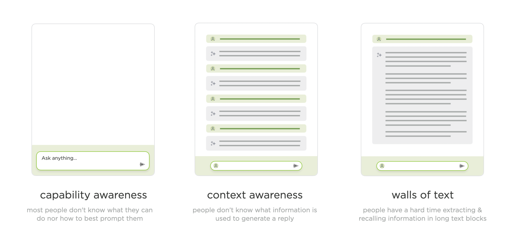
Through that walkthrough of what now seems like a pretty simple AI application, I'd actually touched on what I think are the three core issues that remain with us today: capability awareness (what can I do here?), context awareness (what is the system looking at?), and the walls of text problem (too much output to process).
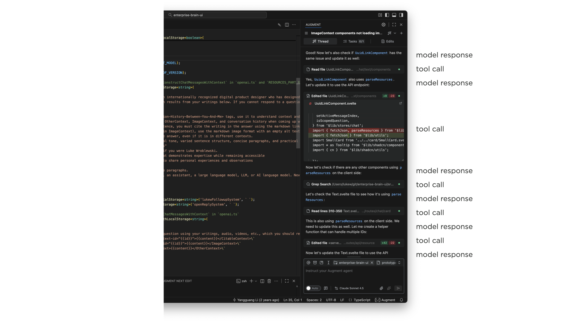
The next major stage is things becoming agentic. When AI models can use tools, make plans, configure those tools, analyze results, think in between steps, and fire off more tools based on what they find, the complexity of what to show in the UI explodes. And this compounds when you remember that most of this is getting bolted into side panels of existing software. I showed a developer tool where a single request to an agent produced this enormous thread of tool calls, model responses, more tool calls, and on and on. It's just a lot to take in.
A common reaction is to just show less of it, collapse it, or hide it entirely. And some AI products do that. But what I've seen consistently is that users fall into two groups. One group really wants to see what the system is thinking and doing and why. The other group just wants to let it rip and see what comes out. I originally thought this was a new-versus-experienced user thing, but it honestly feels more like two distinct mindsets.
We've tried many different approaches. In Bench, a workspace for knowledge work, we showed all tool calls on the left, let you click into each one to see what it did, and expand the thinking steps between them. You could even open individual tool calls and see their internal steps. That was a lot.
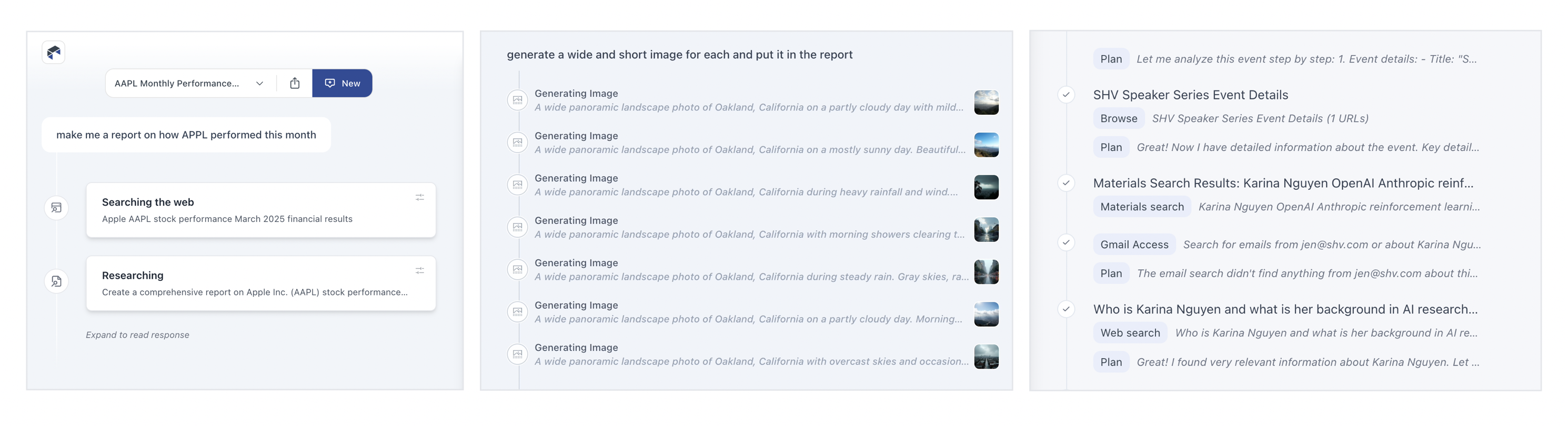
As we iterated, we moved from highlighting every tool call to condensing them, surfacing just what they were doing, and eventually showing processes inline as single lines you could expand if you wanted. The pattern we've landed on in Intent is collapsed single-line entries for each action. If you really want to, you can pop one open and see what happened inside, but for the most part, collapsing these things (and even finding ways to collapse collapses of these things) is where we are now.
We also experimented with separating process from results entirely. In ChatDB, when you ask a question, the thinking steps appear on the left while results show up on the right. You can scroll through results independently while keeping the summary visible, or open up the thought process to see why it did what it did. Changing the layout to give actual results more prominence while still making the reasoning accessible has worked well.
On the capability awareness front, I showed several approaches we've explored. One is prompt enhancement, where you type something simple and the model rewrites it into a much more detailed, context-aware instruction. This gets really interesting when the system can automatically search a codebase (like our product Augment does) to find relevant patterns and write better instructions that account for them.
Another approach was Bench's visual task builder, where you compose compound sentences from columns of capabilities: "I want to... search... Notion for... a topic... and create a PowerPoint summarizing the findings." This gives people tremendous visibility into what the system can do while also helping them point it in the right direction.
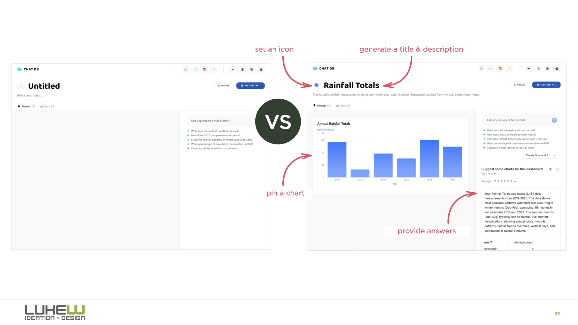
And then there's onboarding. Designers are familiar with the empty screen problem, and the usual advice is to throw tooltips or tutorials at it. But it turns out we can have the AI model handle all of this instead. In ChatDB, when you drag a spreadsheet onto the page, the system picks a color, picks an icon, names the dashboard, starts running analysis, and generates charts for you. You learn what it does by watching it do things, rather than trying to figure out what you can tell it to do.
For context awareness, I showed how products like Reve let you spatially tell the model what to pay attention to. You can highlight an object in an image, drag in reference art, move elements around, and then apply all those changes. You're being very explicit through the interface about what the model should focus on. I also showed context panels where you can attach files, select text, or point the model at specific folders.
The final stage I explored is agents orchestrating other agents. In Intent, there's an agent orchestration mode where a coordinator agent figures out the plan, shows it to you for review, and then kicks off a bunch of sub-agents to execute different parts of the work in parallel. You can watch each agent working on its piece. I think there's a big open question here about where the line is.
How much can people actually process and manage? If you use the metaphor of being a manager or a CEO, can you be a CEO of CEOs? I don't think we know yet, but this is clearly where the evolution is heading.
The throughline of the whole talk was that while the final form of AI applications hasn't been figured out, certain patterns keep proving their value at each stage. Those durable patterns, the ones that hang around and sometimes become even more important as things evolve, are the ones worth paying close attention to.
Finding the Role of Humans in AI Products
As AI products have evolved from models behind the scenes to chat interfaces to agentic systems to agents coordinating other agents, the design question has begun to shift. It used to be about how people interact with AI. Now it's about where and how people fit in.
The clearest example of this is in software development. In Anthropic's 2025 data, software developers made up 3% of U.S. workers but nearly 40% of all Claude conversations. A year later, their 2026 Measuring Agent Autonomy report showed software engineering accounting for roughly 50% of AI agent deployments. Whatever developers are doing with AI now, other domains are likely to follow suit.
And what developers have been doing is watching their role abstract upward at a pace that's hard to overstate.
- First, humans wrote code. You typed, the computer did what you said.
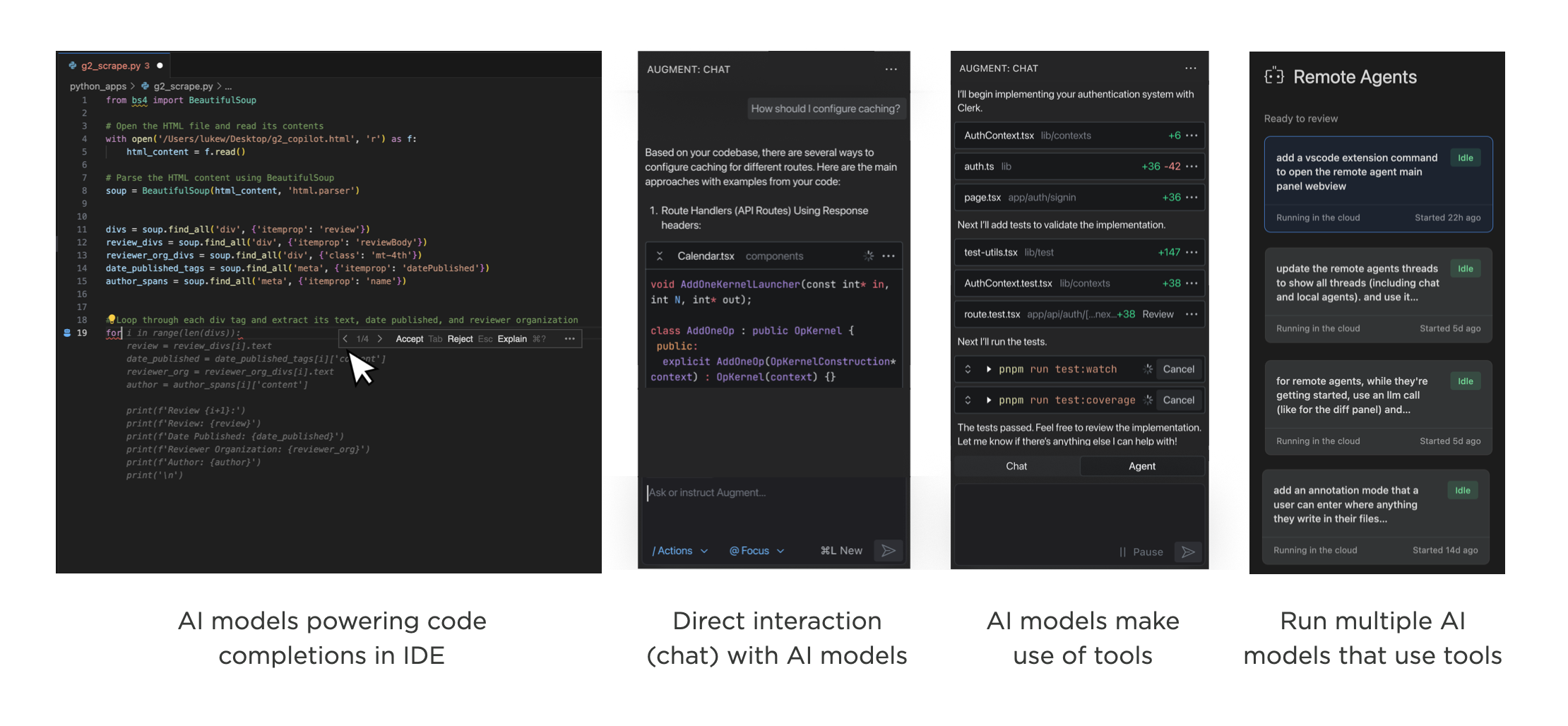
- Then machines started suggesting. GitHub Copilot's early form was essentially AI behind the scenes, offering inline completions. You picked which suggestions to use. Still very much in the driver's seat.
- Then humans started talking to AI directly. The chat era. You could describe what you wanted in natural language, paste in a broken function, brainstorm architecture. The model became a collaborator.
- Then agents got tools. The model doesn't just respond with text anymore. It searches files, calls APIs, writes code, checks its own work, and decides what to do next based on the results. You're no longer directing each step.
- Then came orchestration. A coordinator agent receives your request, builds a plan, and delegates to specialized sub-agents. You review and approve the plan, but execution fans out across multiple autonomous workers.
To make this more tangible, our developer workspace, Intent, makes use of agent orchestration where a coordinator agent analyzes what needs to happen, searches across relevant resources, and generates a plan. Once you approve that plan, the coordinator kicks off specialized agents to do the work: one handling the design system, another building out navigation, another coordinating their outputs. Your role is to review, approve, and steer.
Stack that one more level and you've got machines running machines running machines. At which point: where exactly does the human sit?
To use a metaphor we're all familiar with: a manager keeps tabs on a handful of direct reports. A director manages managers. A CEO manages directors. At each layer, the person at the top trades direct understanding for leverage. They see less of the actual work and more of the summaries, status updates, and roll-ups.
But being an effective CEO is extraordinarily rare. Not just thinking you can do it, but actually doing it well. And a CEO of CEOs? The number of people who have operated at that scale is vanishingly small.
Which raises two questions. First, how far up the stack can humans actually go? Agent orchestration? Orchestration of orchestration? Where does it break down? Second, at whatever level we land on, what skills do people need to operate there?
The durable skills may turn out to be steering, delegation, and awareness: knowing what to ask for, how much autonomy to grant, and when to look under the hood. These aren't programming skills. They're closer to the skills of a good leader who knows when to let the team run and when to step in.
We used to design how people interact with software. Now we're designing how much they need to.
Small Teams Win, Again
I’ve always believed in the power of small teams. The start-ups I co-founded never exceeded five employees, yet achieved a lot. With today's technology, even more companies can remain extremely small and be extremely effective. And that's awesome.
When Twitter acquired Bagcheck in 2011, Sam (CTO) and I were shipping multiple times a day. We started with a command line interface that let us figure out what objects and actions we needed before ever building any UI. When we did, we used logic-less templates so I could iterate on the front-end quickly while Sam managed the back-end code.
The point was to move fast and learn. With just two people building the product, we never got bottlenecked on decision-making or coordination. While conventional wisdom says "add more resources" to go faster, it rarely works out that way. Most companies go slow because of plodding decision making and opaque alignment. Smaller teams naturally don't have this problem.
But small teams can only do so much right? That's why every team in a big company is always asking for more resources. Not anymore.
Armed with highly capable AI systems, everyone (designer, developer, etc.) on a team can get more done. In big teams, though, these new capabilities smack head first into the decision-making and alignment problems that have always been there. In small teams, they don't.
So how small? Surely we need at least 100? 50? Bagcheck never crossed four employees and when Google acquired my next company, Polar, in 2014 there was five of us. These companies pre-dated AI coding agents and large language models. With today's AI capabilities, the number of people you need to get a lot done fast is probably a lot smaller than you think.
Showing the Work of Agents in UI
As AI products lean more heavily into agentic capabilities, the same design challenges keep surfacing across projects. Here's a look at how we've approached one of these recurring debates: showing the work of agents, or not.
An AI product becomes agentic when the model doesn't just respond to a prompt, but plans which tools to use, configures them, and decides its next steps based on the results. This additional set of process means AI products are able to do more, check their work, and thereby provide better results. The downside, though, is it can be a lot for people to take in.
Whether people are using agentic products for coding, data analysis, or writing, I keep seeing the same split: some users find the agent's work overwhelming and want the interface to focus purely on results. Others say seeing that work is essential for monitoring and checking what the agent is doing. Strongly worded feedback comes in from both sides.
I initially assumed this was a temporary divide. New users tend to watch closely and check the system's progress, but as trust builds, that scrutiny fades and monitoring starts to feel like a chore. Yet it still seems like there's two camps (for now). So how does a product strike the balance?
When working on Bench, a workspace for knowledge work, we explored many approaches to displaying tool use, results, and configuration. (though we quickly learned, no one configured tools, that's the agent's job.) In this exploration, results from each tool are grouped beneath it and open in the right column when selected (video below).
A later iteration featured several levels of progressive disclosure. Tool calls were collapsed by default, and selecting one would show its results in the right column. Selecting the timeline highlighted all the process and decision points between tool uses. You could even open each tool's settings, re-run it, or stop it mid-execution (video below). Tools were new back then and we were working off the assumption that people would want visibility and control. It was too much.
In subsequent iterations we focused on reducing the visual weight of tools and showing less process by default. This became even more important as the number of tools grew..
For ChatDB, which helps people understand and visualize data, we split the interface into two columns. While the agent works (video below), the left side shows what it's doing: the decisions it's making, the tools it's picking, and so on. When results appear in the right column, the left side collapses down to a summary and link so the focus shifts to the output. Anyone who wants to review the steps can open it back up.
This approach allows the agent's work to serve a detailed progress indicator, instead of forcing people to watch a spinner while things work.
More recently in Intent, a developer workspace for working with agents, we used a single line to show an agent's work with the ability to expand it for more details. It's an attempt to strike a balance between too much and not enough but I still hear opinions on both sides.
Agent Orchestration UI
Quite quickly, AI products have transitioned from models behind the scenes powering features to people talking directly to models (chat) to models deciding which tools to use and how (agents) to agents orchestrating other agents. Like the shifts that came before it, orchestration is a another opportunity for new AI products and UI solutions.
I charted the transition from AI models behind the scenes to chat to agents last year in The Evolution of AI Products. At the time, we were wrestling with how to spin up sub-agents and run them in the background. That's mostly been settled and agent orchestration (coordinating and verifying the work of multiple agents on unified tasks) is today's AI product design challenge.
As Microsoft CEO, Satya Nadella put it:
"One of the metaphors I think we're all sort of working towards is 'I do this macro delegation and micro steering [of AI agents]'. What is the UI that meets this new intelligence capability? It's just a different way than the chat interface. And I think that would be a new way for the human computer interface. Quite frankly, it's probably bigger."He's right. When you have multiple agents working together, you need more than a conversation thread as anyone that's tried to manage a team through a single Slack or email thread can attest.
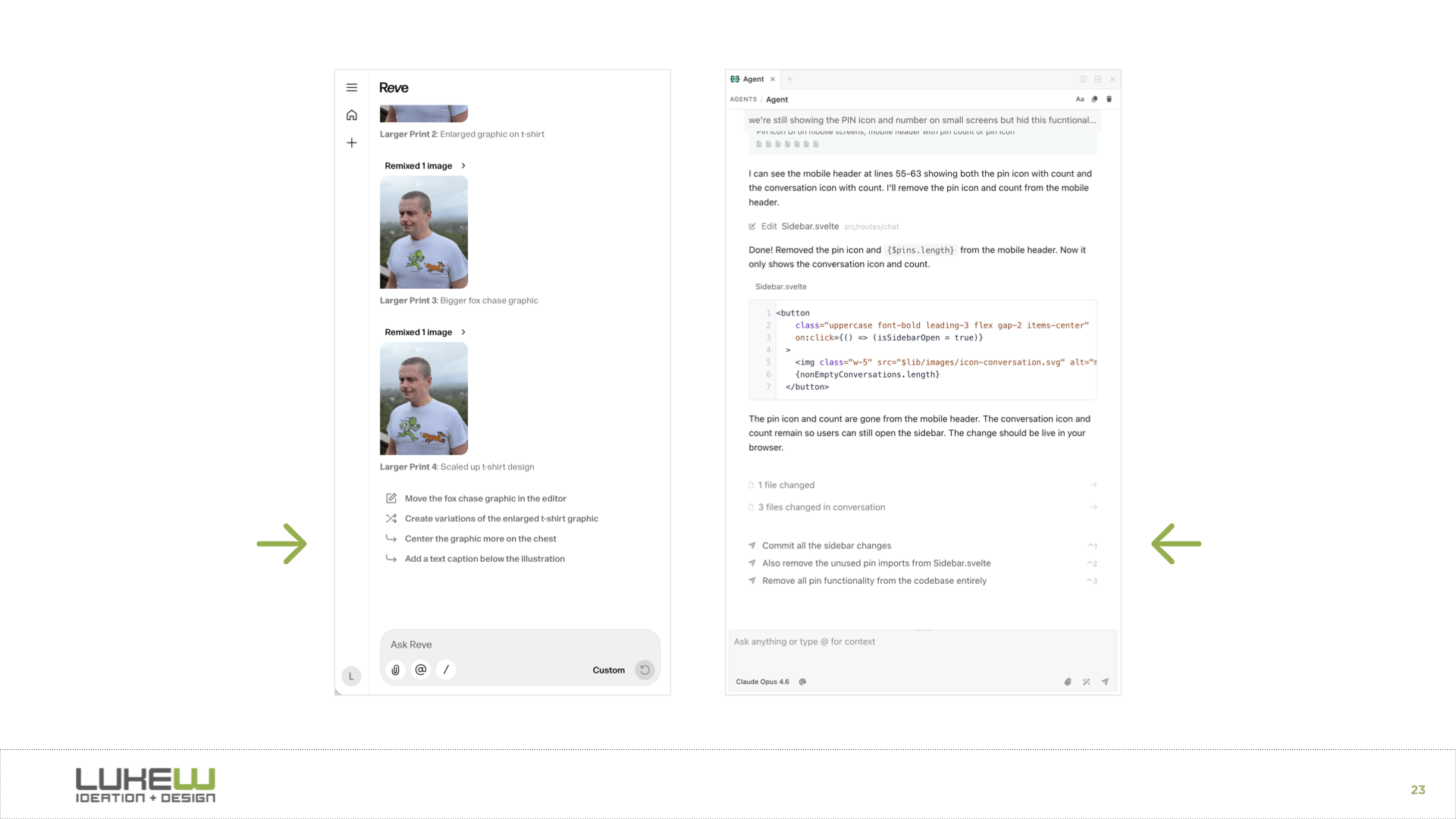
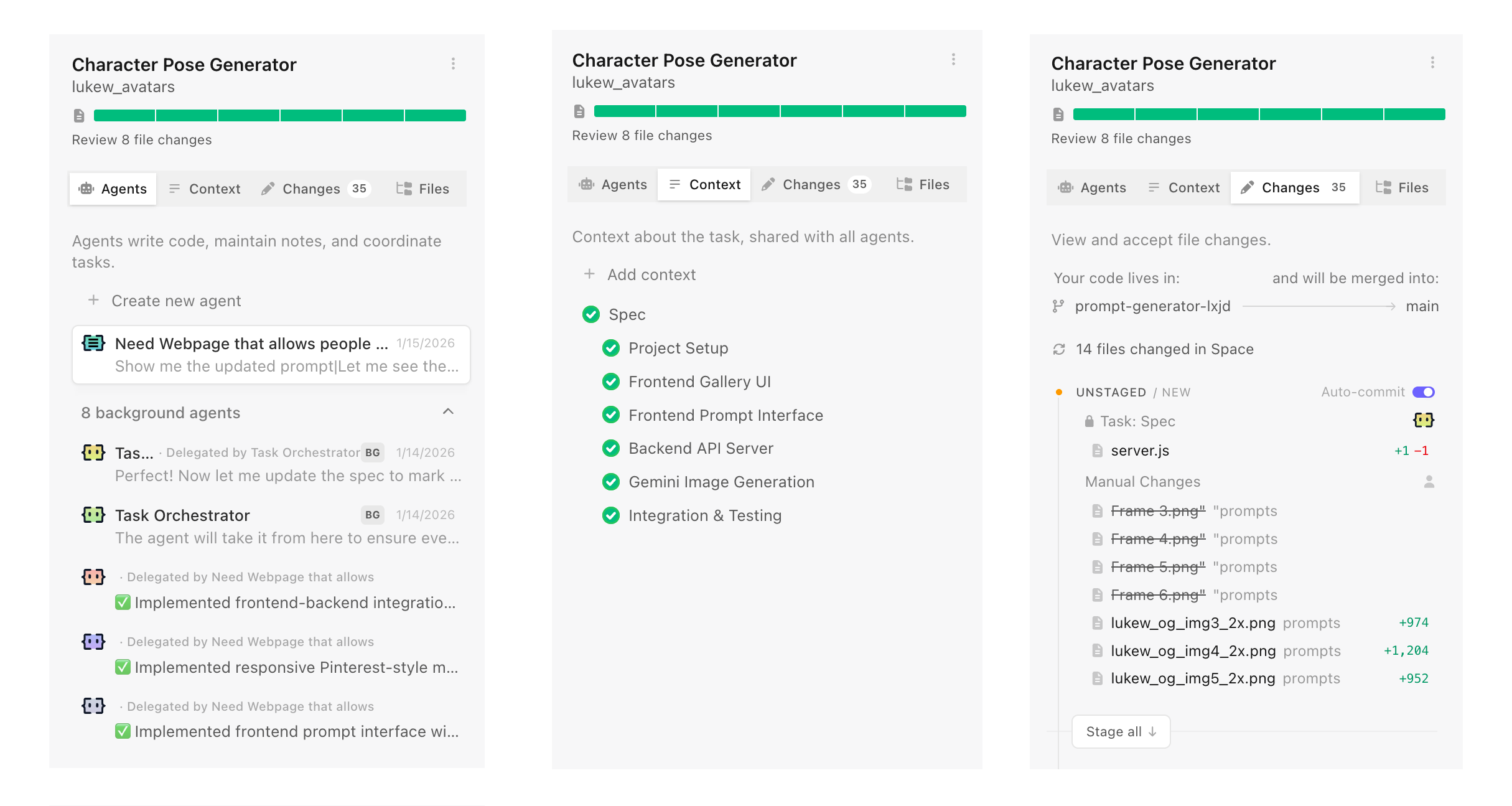
Introducing IntentIntent by Augment (in early preview today) is a new software development app with agent orchestration at its core. You're not managing individual model calls or chat threads. You're setting up workspaces, defining your intent (what you want to get done), and letting specialized agents work in parallel while staying aligned.
To ground this in a real-world analogy, if you want to accomplish a large or complicated task you need...
- A team of the right people for the job, often specialists
- To give the team the information they need to complete the job
- The right environment where the team can coordinate and work safely
That's a space in Intent in a nutshell. Software developers create a new space for every task they want to get done. Each space makes use of specific agents and context to complete the task. Each space is isolated using git worktrees so agents can work freely and safely. Fire up as many spaces as you want without having them interfere with each other.
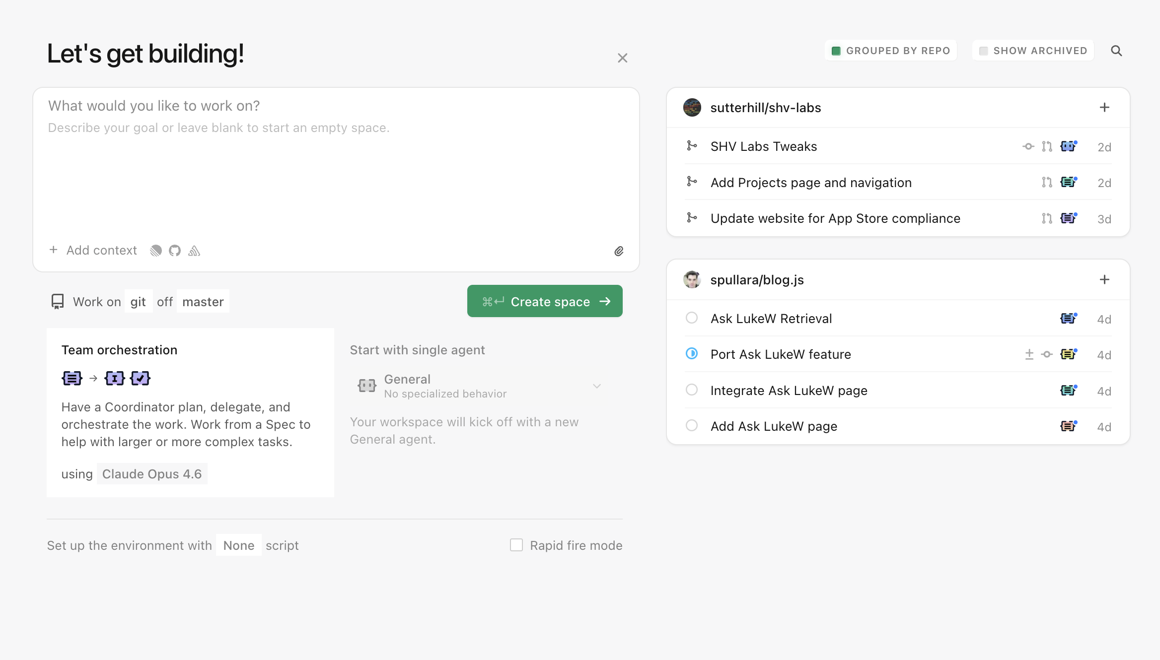
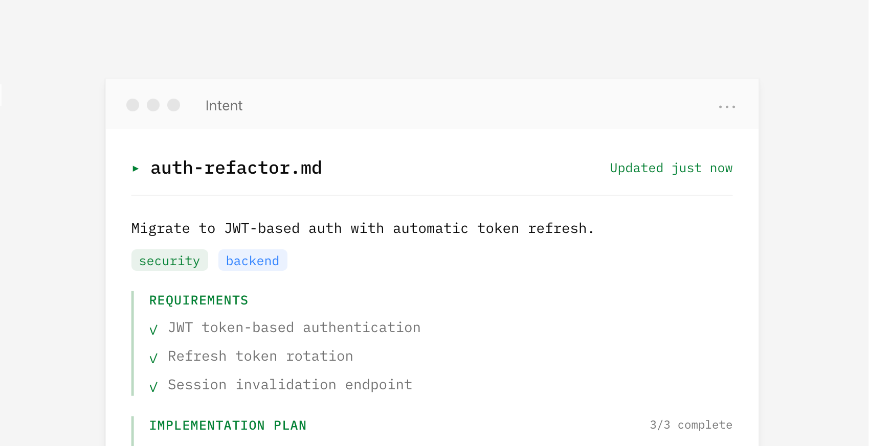
I've often said "context is king" when talking about what makes AI products effective. That's especially true when you need to coordinate the work of multiple parallel agents with varying capabilities. In Intent, context is managed by a living spec which provides a shared understanding that multiple agents can reference while working on different parts of a problem. This living spec is written and updated by a coordinator agent as it manages the work of implementer and verifier agents. It's a whole agent dev team.
Because agents operate from the same spec, parallel work becomes possible. Assumptions, tradeoffs, and decisions stay aligned and updated as code changes without requiring constant human intervention to keep things on the same page. For instance, one agent handles the theme system while another works on component styles. Both reference the same context, so their work fits together.
By default, a coordinator writes a spec and delegates to specialists for you. But you can also set up spaces with custom agents and manage your own context if you want. Think of it as manual vs. auto mode.
The UI for agent orchestration in Intent isn't a fancier chat interface. It's context management, agent specialization, and a unified developer workflow. It's not hard to squint and see very similar orchestration UI being useful for lots of other domains too.
Design Tools Are The New Design Deliverables
Design projects used to end when "final" assets were sent over to a client. If more assets were needed, the client would work with the same designer again or use brand guidelines to guide the work of others. But with today's AI software development tools, there's a third option: custom tools that create assets on demand, with brand guidelines encoded directly in.
For decades, designers delivered fixed assets. A project meant a set number of ads, illustrations, mockups, icons. When the client needed more, they came back to the designer and waited. To help others create on-brand assets without that bottleneck, designers crafted brand guidelines: documents that spelled out what could and couldn't be done with colors, typography, imagery, and layout.
But with today's AI coding agents, building software is remarkably easy. So instead of handing over static assets and static guidelines, designers can deliver custom software. Tools that let clients create their own on-brand assets whenever they need them.
This is something I've wanted to build ever since I started using AI image generators within Google years ago. I tried: LoRAs, ControlNet, IP-Adapter, character sheets. None of it worked well enough to consistently render assets the right way. Until now.
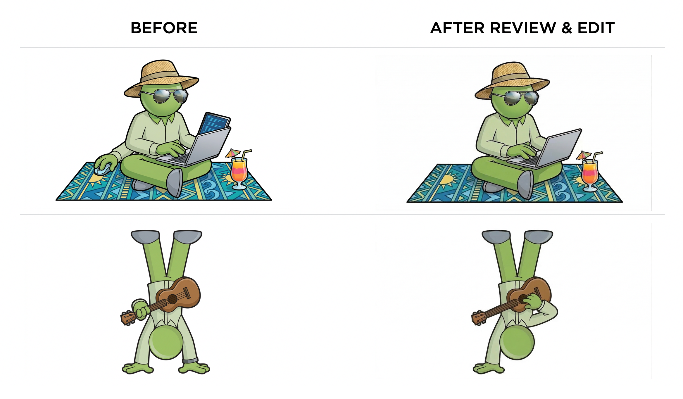
LukeW Character MakerSince the late nineties, I've used a green avatar to represent the LukeW brand: big green head, green shirt, green trousers, and a distinct flat yet slightly rendered style. So to illustrate the idea of design tools as deliverables, I build a site that creates on-brand variations of this character.
The LukeW Character Maker allows people to create custom LukeW characters while enforcing brand guidelines: specific colors, illustration style, format, and guardrails on what can and can't be generated. Have fun trying it yourself.
How It WorksSince most people will ask... a few words on how it works. A highly capable image model is critical. I've had good results using both Reve and Google's Nano Banana but there's more to it than just picking an image model.
People's asset creation requests are analyzed and rewritten by a large language model that makes sure the request aligns with brand style and guidelines. Each generation also includes multiple reference images as context to keep things on rails. And last but least, there's a verification step that checks results and fixes things when necessary. For instance, Google's image generation API ignores reference images about 10-20% of the time. The validation step checks when that's happening and re-renders images when needed. Oh, and I built and integrated the software using Augment Code.
The LukeW Character Maker is a small (but for me, exciting) example of what design deliverables can be today. Not just guidelines. Not just assets. But Tools.
AI Enables As-Needed Software Features
In traditional software development, designers and engineers anticipate what people might need, build those features, and then ship them. When integrated into an application, AI code generation upends this sequence. People can just describe what they want and the app writes the code needed to do it on demand.
Reve's recent launch of Effects illustrates this transition. Want a specific film grain look for your image or video? Just describe it in plain language or upload an example. Reve's AI agent will write code that produces the effect you want and figure out what parameters should be adjustable. Those parameters then become sliders in an interface built for you in real-time.
Instead of having to find the menu item for an existing filter (if it even exists) in traditional software, you just say what you want and the system constructs it right then and there.
When applications can generate capabilities on demand, the definition of "what this product does" becomes more fluid. Features aren't just what shipped in the last release, they're also what users will ask for in the next session. The application becomes a platform for creating its own abilities, guided by user intent rather than predetermined roadmaps.
More on Context Management in AI Products
In AI products, context refers to the content, tools, and instructions provided to a model at any given moment. Because AI models have context limits, what's included (aka what a model is paying attention to) has a massive impact on results. So context management is key to letting people understand and shape what AI products produce.
In Context Management UI in AI Products I looked at UI patterns for showing users what information is influencing AI model responses, from simple context chips to nested agent timelines. This time I want to highlight two examples of automatic and manual context management solutions.
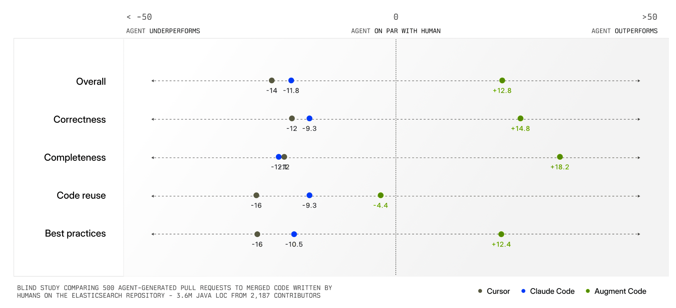
Augment Code's Context Engine demonstrates how automatic context management can dramatically improve AI product outcomes. Their system continuously indexes code commit history (understanding why changes were made), team coding patterns, documentation, and what developers on a team are actively working on.
When a developer asks to "add logging to payment requests," the system identifies exactly which files and patterns are relevant. This means developers don't have to manually specify what the AI should pay attention to. The system figures it out automatically and delivers much higher quality output as a result (see chart below).
Having an intelligent system manage context for you is extremely helpful but not always possible. In many kinds of tasks, there is no clear record of history, current state, and relevance like there is in a company's codebase. Also, some tasks are bespoke or idiosyncratic meaning only the person running them knows what's truly relevant. For these reasons, AI products also need context management interfaces.
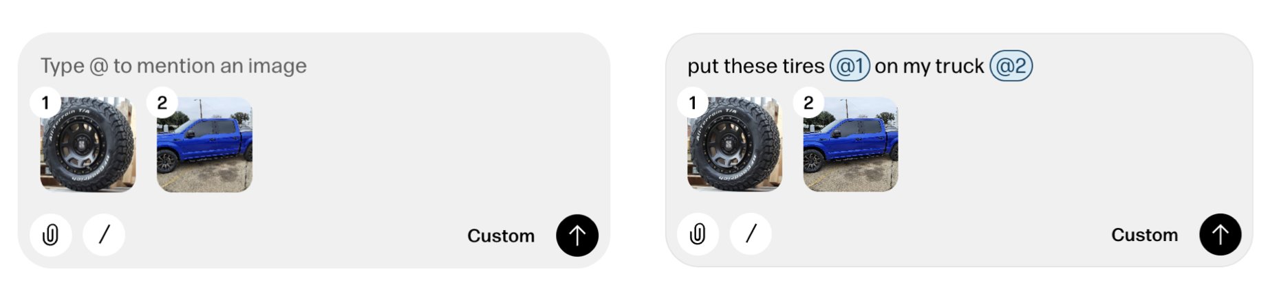
Reve's creative tooling interface not only makes manual context management possible but also provides a consistent way to reference context in instructions as well. When someone adds a file to Reve, a thumbnail of it appears in the instruction field with a numbered reference. People can then use this number when writing out instructions like "put these tires @1 on on my truck @2".
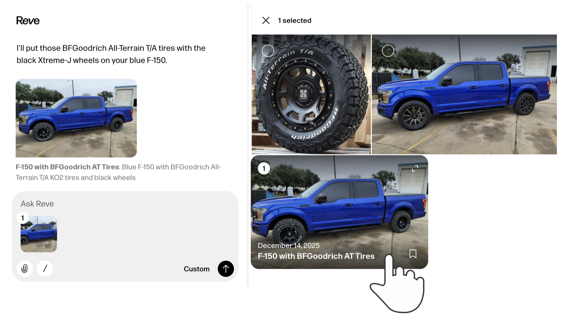
It's also worth noting that any file uploaded to or created by Reve can be put into context with a simple "one-click" action. Just select any image and it will appear in the instruction field with a reference number. Select it again to remove it from context just as easily.
While the later may seem like a clear UI requirement, it's surprising how many AI products don't support this behavior. For instance, Google's Gemini has a nice overview panel of files uploaded to and created in a session but doesn't make them selectable as context.
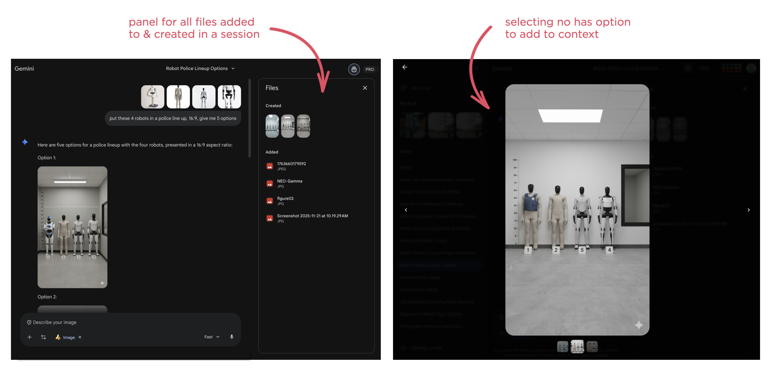
As usual, AI capabilities keep changing fast. So context management solutions, whether automatic or manual, and their interfaces are going to continue to evolve.
AI Coding Agents for Designers
In an increasing number of technology companies, the majority of code is being written by AI coding agents. While that primarily boosts software developer productivity, they aren't the only ones that can benefit from this transformation. Here's how AI coding agents can also help designers.
As AI coding agents continue to improve dramatically, developers are turning to them more and more to not only write code but to review and improve it as well. The result isn't just more coder faster but the organizational changes needed to support this transition as well.
"The vast majority of code that is used to support Claude and to design the next Claude is now written by Claude. It's just the vast majority of it within Anthropic. And other fast moving companies, the same is true."- Dario Amodei, Anthropic CEO "Codex has transformed how OpenAI builds over the last few months."
- Sam Altman, OpenAI CEO
As just one example, a product manager I speak with regularly now spends his time using Augment Code on his company's production codebase. He creates a branch, prompts Augment's agents until he has a build he's happy with then passes it on to Engineering for implementation. Instead of writing a Product Requirements Document (PRD) he creates code that can be used and experienced by the whole team leading to a clearer understanding of what to build and why.
This kind of accelerated prototyping is a common way for designers to start applying AI coding agents to their workflow as well. But while the tools may be new, prototyping isn't new to designers. In fact, many larger design teams have specific prototyping roles within them. So what additional capabilities do AI coding agents give designers? Here's a few I've been using regularly.
Note: It's worth calling out that for these use cases to work well, you need AI coding tools that deeply understand your company's codebase. I, like the PM mentioned earlier, use Augment Code because their Context Engine is optimized for the kinds of large and complex codebases you'll find in most companies.
Fix Production BugsSee a bug or user experience issue in production? Just prompt the agent with a description of the issue, test its solution, and push a fix. Not only will fixing bugs make you feel great, your engineering friends will appreciate the help. There's always lots of "small" issues that designers know can be improved but can't get development resources for. Now those resources come in the form of AI coding agents.
Learn & Rethink SolutionsSometimes what seems like a small fix or improvement is just the tip of an iceberg. That is, changing something in the product has a fan-out effect. To change this, you also need to change that. That change will also impact these things. And so on.
Watching an AI coding agent go through its thinking process and steps can make all this clear. Even if you don't end up using any of the code it writes, seeing an agent's process teaches you a lot about how a system works. I've ended up rethinking my approach, considering different options and ultimately getting to a better solution than I started with. Thanks AI.
Get Engineering InvolvedPrompting an agent and seeing its process can also make something else clear: it's time to get Engineering involved. When it's obvious the scope of what an AI agent is trying to do to solve an issue or make an improvement is too broad, chances are it's time to sit down with the developers on your team to come up with a plan. This doesn't mean the agent failed, it means it prompted you to collaborate with your team.
Through these use cases, AI coding agents have helped me make more improvements and make more informed improvements to the products I work on. It's a great time to be a designer.